In today’s digital age, having a website for your business is a must. It not only helps establish your brand online but also provides your customers with an easy way to connect with you. However, it’s not enough to just have a website; it needs to be designed in a way that’s responsive and adaptive to various screen sizes and devices. In this article, we’ll explore why responsive web design is essential for your business and how it can benefit you in the long run.
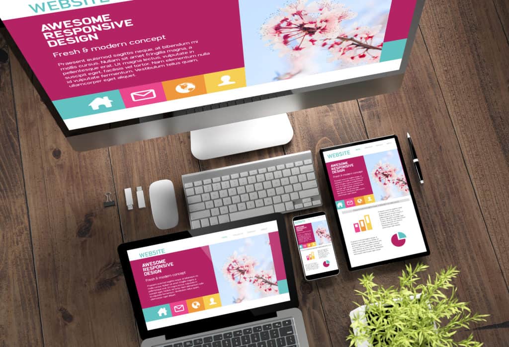
What is Responsive Web Design?
Responsive web design is an approach to website design that ensures that the website’s layout and content adjust automatically based on the screen size and device used to access it. This means that your website will look and function seamlessly whether it’s viewed on a desktop, tablet, or smartphone. The goal of responsive web design is to provide users with a consistent and optimal browsing experience regardless of the device they use.
Why is Responsive Web Design Important for Your Business?
- Mobile Usage is on the Rise
According to a recent report by Statista, mobile devices accounted for over half of all global website traffic in 2020. This trend is expected to continue as more people rely on their mobile devices for browsing the web. If your website is not optimized for mobile devices, you could be missing out on a significant portion of your target audience.
- Improved User Experience
When your website is responsive, users will have a better browsing experience. The website will adjust to the user’s device, ensuring that the content is easy to read and navigate. This improves the user’s experience, making them more likely to stay on your website and explore further. A positive user experience can also increase the likelihood of users returning to your website in the future.
- Better SEO
Responsive web design can also have a positive impact on your search engine rankings. Google has stated that responsive web design is its recommended design pattern, and responsive websites tend to rank higher in search results. This is because responsive design makes it easier for Google’s algorithms to crawl and index your website, improving your website’s visibility and making it easier for potential customers to find you online.
- Cost-effective
Having a responsive website can be cost-effective in the long run. Instead of designing separate websites for desktop and mobile devices, a responsive design approach ensures that the website can be viewed on any device. This means that you won’t have to invest in separate design and development costs for different versions of your website. Additionally, maintaining a single website is easier and more efficient than managing multiple websites.
- Increased Conversion Rates
A responsive website can also lead to increased conversion rates. When your website is easy to navigate and use, users are more likely to complete the desired action, whether it’s making a purchase, filling out a contact form, or signing up for a newsletter. By improving the user experience, you can increase the likelihood of users converting into customers.
How to Ensure Your Website is Responsive
- Use a Responsive Web Design Framework
The easiest way to ensure that your website is responsive is to use a responsive web design framework such as Bootstrap or Foundation. These frameworks provide pre-designed components and templates that are optimized for mobile devices, making it easy to create a responsive website.
- Prioritize Content
When designing your website, prioritize your content over design elements. Content should be easy to read and navigate, regardless of the device used to access it. Ensure that your website’s font sizes, images, and videos are optimized for various screen sizes and devices.
- Test Your Website on Multiple Devices
It’s important to test your website on multiple devices to ensure that it’s responsive and functions properly. Use tools such as Google’s Mobile-Friendly Test to see how your website looks on different devices and identify any issues that need to be fixed.
- Optimize Images and Videos
Images and videos are an important part of any website, but they can also slow down your website’s loading speed if they’re not optimized for various devices. Ensure that your images and videos are compressed and resized to fit the appropriate screen size.
- Use Responsive Navigation
Navigation is a critical element of website design, and it’s important to ensure that it’s optimized for different devices. Use responsive navigation menus that adapt to different screen sizes and make it easy for users to find what they’re looking for.
Responsive web design is essential for your business in today’s digital age. With mobile usage on the rise and users expecting a seamless browsing experience, having a website that’s responsive can provide numerous benefits, including improved user experience, better SEO, cost-effectiveness, increased conversion rates, and more. By following the tips above and prioritizing responsive design, you can ensure that your website is optimized for all devices and ready to connect with your audience.