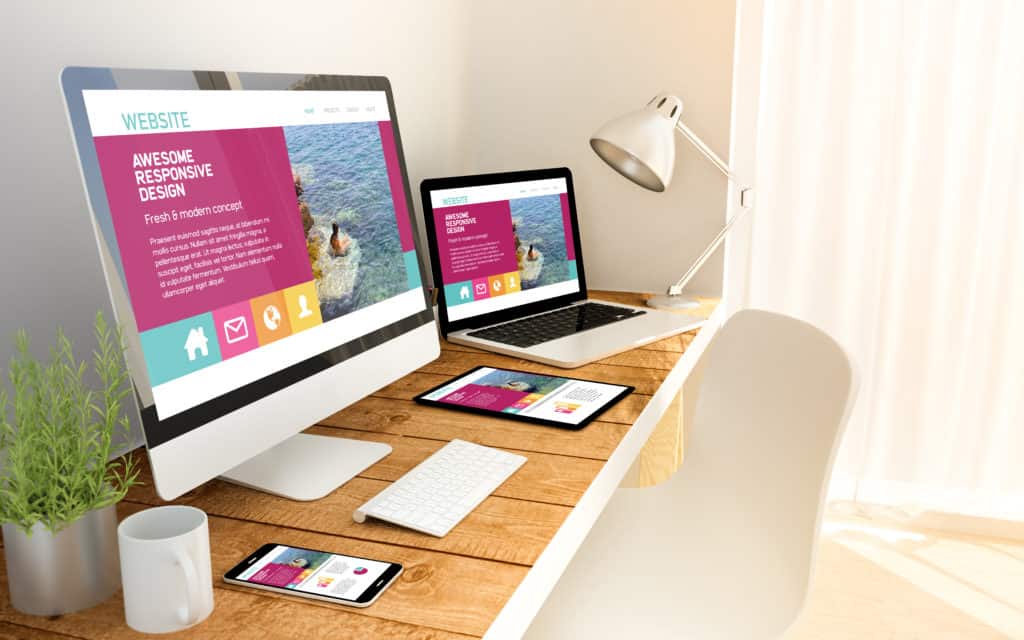
In today’s digital age, having a responsive, mobile-friendly website is more important than ever. With the majority of internet traffic coming from mobile devices, it’s essential for website developers to ensure that their client’s websites are optimized for all screen sizes. One of the most popular platforms for creating websites is WordPress, and there are several tips and tricks that can be used to make sure your WordPress website is responsive and mobile-friendly.
First, it’s important to select a responsive WordPress theme. A responsive theme automatically adapts to different screen sizes, ensuring that the website looks great on all devices. There are many responsive WordPress themes available for free or for purchase. When choosing a theme, pay attention to its features, such as the layout, the number of columns, etc. it should meet your client’s needs and requirements.
Another key aspect of creating a responsive, mobile-friendly website is optimizing the images. Large, high-resolution images can slow down the website’s loading time, which can be frustrating for mobile users. To optimize images, you can use a plugin like Smush or EWWW Image Optimizer to compress them without losing quality.
Additionally, it’s important to ensure that the website’s navigation is easy to use on mobile devices. A common mobile navigation pattern is the “hamburger menu,” which is a button that displays a menu when tapped. This makes it easy for users to access the website’s content, regardless of the device they are using.
Finally, it’s essential to test the website on different devices and screen sizes to ensure that it looks and functions as intended. WordPress has built-in tools such as the Theme Checker and Theme Unit Test Data that can help with this. You can also use online tools like BrowserStack to test the website across different browsers and devices.
In conclusion, creating a responsive, mobile-friendly website is an essential aspect of website development. By using the tips and tricks outlined above, you can ensure that your WordPress website looks great and functions smoothly on all devices. This will help increase traffic and improve the user experience for your client’s customers.